You don’t have to pore over spreadsheets and crunch numbers to know which freight markets are sizzling. With the Hot Market Map feature available in the DAT Power load board and our standalone transportation pricing tool, DAT RateView, you can see where demand is highest at just a glance.
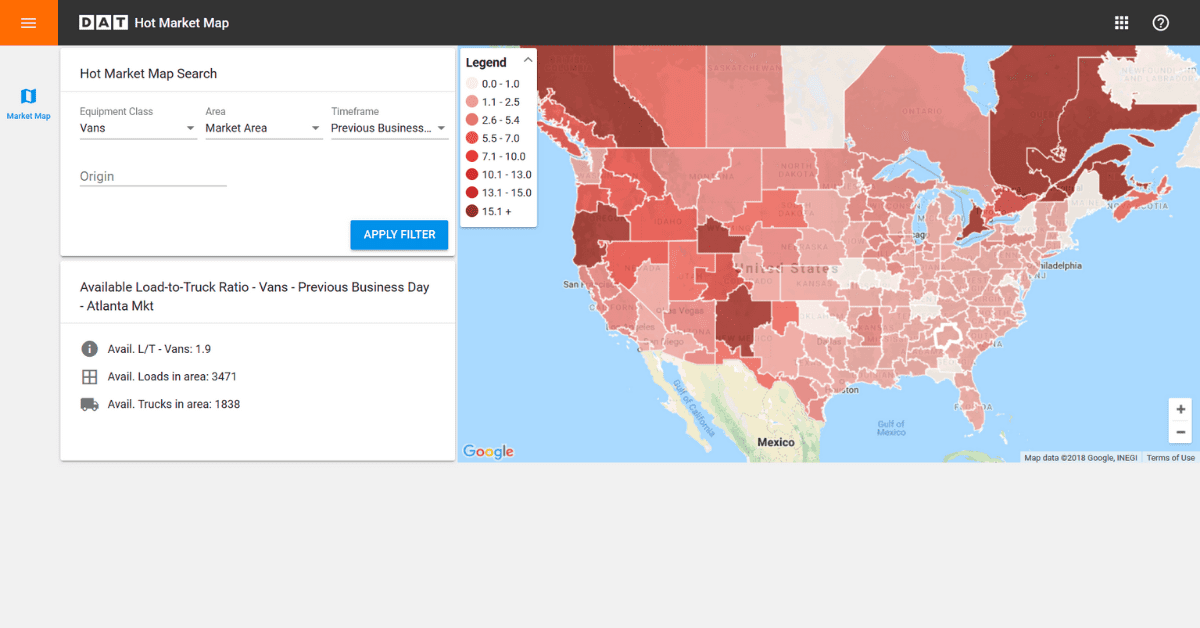
The map shows you the hottest freight markets based on the load-to-truck ratio, the number of load posts on DAT load boards by the number of truck posts. The darker the color, the higher the ratio, meaning that trucks are harder to find in that area. Carriers use that info to know how much competition there is for freight, and brokers use it to know where it might cost more to cover a load. And when the ratio moves up or down, freight rates usually follow.
We’ve also recently made big improvements to the Hot Market Maps, with the familiar Google Maps look.
Contact us to add Hot Market Maps to your load board subscription

Hot Market Maps has a new look. This map shows the load-to-truck ratio for vans in the Atlanta market for the previous business day.
What’s new:
- More color shadings to more accurately reflect load-to-truck ratios, for all three equipment types.
- Easier city/state search options
- Quicker access to the total number of loads vs trucks from the previous day
We’ll be adding more features in the coming months, including historic load-to-truck ratio data so that you can see how seasonality affects each freight market and state.
How to find Hot Market Maps
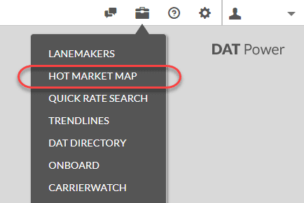
All that information is right at your fingertips and lets you make quick business decisions. Just click on the toolbox icon in the top-right corner of DAT Power or RateView, and you’ll find the Hot Market Map right alongside tools such as LaneMakers and the DAT Directory.

Not already a DAT customer? Learn more about DAT RateView and the DAT Power load board. You can also give us a call at 800.551.8847 or contact us here.


